Radar Plot#
Let us start by generating some data:
[1]:
import numpy as np

np.random.seed(3)

ideal_point = np.array([0.15, 0.1, 0.2, 0.1, 0.1])
nadir_point = np.array([0.85, 0.9, 0.95, 0.9, 0.85])

F = np.random.random((1, 5)) * (nadir_point - ideal_point) + ideal_point
print(F)
[[0.53555853 0.66651826 0.41817855 0.50866208 0.76971022]]
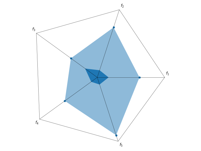
If the values should not be normalized, then we can plot the ideal and nadir point. This keeps the absolute values of each objective. The outer shape represents the nadir point, the inner area the ideal point. All points will lie in the area spanned by those two points additionally.
[2]:
from pymoo.visualization.radar import Radar

plot = Radar(bounds=[ideal_point, nadir_point], normalize_each_objective=False)
plot.add(F)
plot.show()
[2]:
<pymoo.visualization.radar.Radar at 0x707003716950>
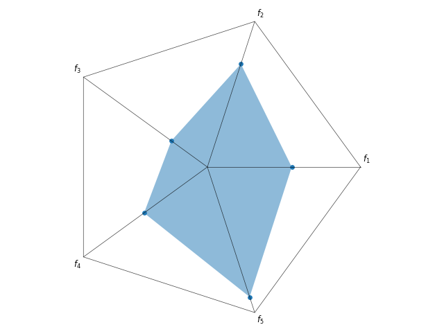
But if the scale of the objective is too different, then normalization is recommended. Then, the ideal point is just the point in the middle, and the nadir point is now symmetric.
[3]:
plot = Radar(bounds=[ideal_point, nadir_point])
plot.add(F)
plot.show()
[3]:
<pymoo.visualization.radar.Radar at 0x706fea948a90>
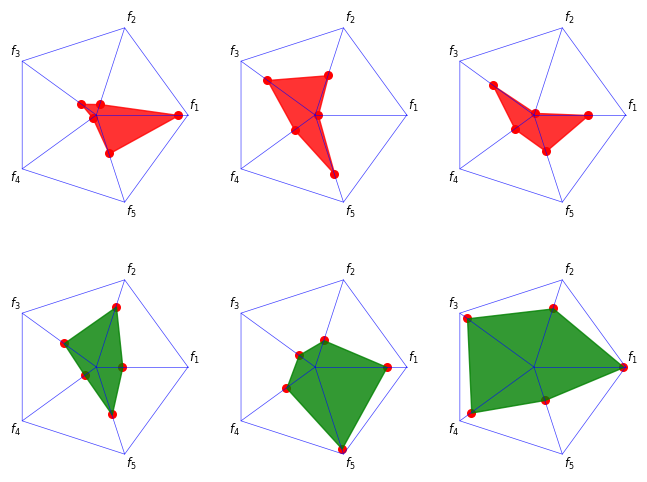
[4]:
F = np.random.random((6, 5)) * (nadir_point - ideal_point) + ideal_point

plot = Radar(bounds=[ideal_point, nadir_point],
             axis_style={"color": 'blue'},
             point_style={"color": 'red', 's': 30})
plot.add(F[:3], color="red", alpha=0.8)
plot.add(F[3:], color="green", alpha=0.8)
plot.show()
[4]:
<pymoo.visualization.radar.Radar at 0x706fecfd1790>
API#
- class pymoo.visualization.radar.Radar(normalize_each_objective: bool = True, n_partitions: int = 3, point_style: dict | None = None, **kwargs)[source]
Radar plot visualization.
- Parameters:
normalize_each_objective – Whether each objective is normalized. Otherwise, the inner and outer bound is plotted.
n_partitions – Number of partitions to show in the radar.
point_style – The style being used to visualize the points.
reverse – {reverse}
axis_style – {axis_style}
labels – {labels}
figsize – {figsize}
title – {title}
legend – {legend}
tight_layout – {tight_layout}
cmap – {cmap}