
Petal Diagram#
Also, it might be interesting to compare one solution with another. Here, a visual of a single solution regarding its trade-offs.
Let us visualize some test data:
[1]:
import numpy as np

np.random.seed(1234)
F = np.random.random((1, 6))
print(F)
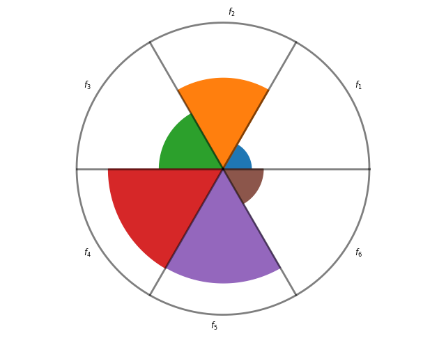
[[0.19151945 0.62210877 0.43772774 0.78535858 0.77997581 0.27259261]]
A simple petal plot can be created by:
[2]:
from pymoo.visualization.petal import Petal

Petal(bounds=[0, 1]).add(F).show()
[2]:
<pymoo.visualization.petal.Petal at 0x7e9bb56d3810>
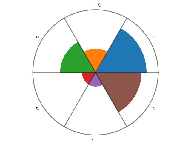
If you prefer to visualize smaller values with a larger area, set reverse=True:
[3]:
Petal(bounds=[0, 1], reverse=True).add(F).show()
[3]:
<pymoo.visualization.petal.Petal at 0x7e9bb3394610>
[4]:
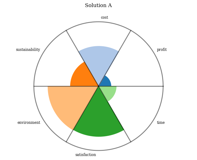
plot = Petal(bounds=[0, 1],
             cmap="tab20",
             labels=["profit", "cost", "sustainability", "environment", "satisfaction", "time"],
             title=("Solution A", {'pad': 20}))
plot.add(F)
plot.show()
[4]:
<pymoo.visualization.petal.Petal at 0x7e9bb2c36150>
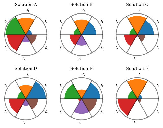
Each add will plot solutions in a row. Each entry represents a column. Different solutions can be easily compared.
[5]:
F = np.random.random((6, 6))
plot = Petal(bounds=[0, 1], title=["Solution %s" % t for t in ["A", "B", "C", "D", "E", "F"]])
plot.add(F[:3])
plot.add(F[3:])
plot.show()
[5]:
<pymoo.visualization.petal.Petal at 0x7e9bb3071710>
API#
- class pymoo.visualization.petal.Petal(bounds=None, **kwargs)[source]
Initialize Petal diagram.
- Parameters:
bounds – The boundaries for each objective. Necessary to be provided for this plot!
**kwargs – Additional keyword arguments passed to parent Plot class.